October 31, 2013

Autumn at Le Vieux Port in Montreal


This pic was taken with an iphone a couple of weeks ago in Montreal, while I was walking along the Vieux Port watching the first colours of Autumn coming out.

October 30, 2013

Film review. An analysis of the cinematography of Prisoners, by Denis Villeneuve

Prisoners is the last work by Quebecois director Denis Villeneuve (Incendies, Polytechinque, Maelström), a suspenseful as well as disturbing thriller with a great script.

The Plot. On thanksgiving day, two six year old girls disappear. Despite the police investigation, which seems to lead nowhere, the father of one of the girls decides to take matters into his own hands, using desperate and unorthodox methods.


Cinematography: Roger Deakins
Camera: Arri Alexa Plus and Studio
Lenses:  Zeiss Master Prime
Aspect ratio: 1.85:1
Format: ARRIRAW
Film Stock: -

Prisoners is the first collaboration between director D. Villeneuve and one of the finest living cinematographers, Roger Deakins (Skyfall, No Country for Old Men, A Beautiful Mind, The Hurricane...) and the result is outstanding.

Once again, the British cinematographer chooses the Arri Alexa and Master Prime Zeiss lenses to shoot Prisoners: this choice is not only dictated by Deakin's preferences and own style, but also for the way of shooting the film and the results he was expecting. The resolution, the latitude and the details offered by camera and lenses were necessary to shoot often in very low light conditions without jeopardizing the image quality and neatness.

Light has a natural feel throughout the film. Most of the time characters are lit with a single light placed outside windows when it imitates the daylight or on one side in the indoor shots imitating on set lights. Sometimes the only lights used on scene are headlamps, flash-lights, neons or candles, and it's in these scenes where we can see Deakins' great work: contrast is high, light is low and shadows are really deep and yet the image is clean and beautiful.

Prisoners is a dark film and Deakins shows it by the way of lighting. There's no sign of the sun throughout the film: all the exteriors are shot on dull days, sometimes in rainy or even snowy ones. That results in an overall grey tone with desaturated colours, an aesthetic that goes very well with the story. In the indoor shots, characters are almost always backlit or side lit, creating silhouettes and  a strong contrast. By this way of lighting, characters are often shadows that move in the scene: this suits perfectly the characters who have somehow something to hide.

As a good thriller as it is, Prisoners releases pieces to complete the puzzle one by one; to enhance this concept Deakins offers us some of the most artistic images of the film. The frame is like a black canvas where the British master draws few brush-stroke of light, lighting half a face of a character or some details of the scene. The shadows gain great importance for the story: they are what is not seen or known, the secrets and the unconscious, they are where the truth lays.

Camera movements are dosed and imperceptible helping the audience to stay in the story, a purpose also achieved by the focal lengths used, never too wide  nor too telephoto, always staying within the normal range of the 50mm, avoiding perspective distortions and offering a more natural look.

Prisoners is a very well made film brilliantly directed by D. Villeneuve who managed to build tension since the first frame. With his stunning work R. Deakins teaches us that cinematography isn't necessarily about where placing the camera to get the best possible angle, but it's about enhancing the story and finding the way to make a moment or an emotion more beautiful, more intense, more powerful. 

October 29, 2013

Light tips. How to light a subject with light coloured hair

Every subject is different and has different characteristics, that's why we have to light every subject with different light: lighting is a powerful tool to hide or enhance features in a portrait. Here are some tips about how to light a subject with light coloured hair.

Do not use a strong Back Light: reduce it instead to get a better balanced exposure.

Do lower the contrast of the illumination: in this way you'll avoid the hair to pop up.

Do leave the hair in shadows: alternatively you could diffuse the light on the area.

Do lower the camera angle: you'll get less hair in the frame and therefore less exposure problems.

Hope you find it useful! Stay tuned for more lighting tips!

October 28, 2013

Portrait of a tattooed girl


I liked the shadows light drew on the model's back enhancing the portrait with sensuality.

October 27, 2013

Film review. An analysis of the cinematography of La vie d'Adèle, by Abdellatif Kechiche

La vie d'Adèle (also known as Blue is the Warmest Colour) is a film directed by Abdellatif Kechiche (Venus Noire, The Secret of the Grain, La Faute à Voltaire) that won The  Palm d'Or at this year Cannes Film Festival.

The plot. Adèle is a young girl whose life and sexuality change when she meets Emma. Love and happiness will rise making Adèle grow into a woman, but when their relationship falls apart she has to find back herself.


Cinematography: Sofian El Fani
Camera: Canon Eos C300
Lenses:  Angenieux Optimo 28-76mm T2.6
Aspect ratio: 2.35:1
Format: MPEG-2
Film Stock: -

After working in his previous works, Sofian El Fani (The secret of the Grain, Le Fil, Paris la Métisse) repeats as Kechiche's cinematographer for La Vie d'Adèle. The film, rather than being a story between two homosexuals like everyone expects, is a look at what happen when you fall in love, independently of you gender or sexual orientation. In this sense, La Vie d'Adèle is a kind of documentary about Adèle's emotions, from love and happiness to fear and suffer. The cinematography reflects and enhances this point perfectly.

The choice of the Eos C300 along with just one lens used (a zoom lens but still one lens) is justified for the way of shooting: camera is hand held and follows the characters almost as in a documentary. So the Canon camera and the Angenieux Zoom  offered lightness and practicability for this purpose. Actually, the C-log of the Eos worked really well, given the pleasant image offered, not hard at all as digital cinema normally is.

The Angenieux Lens is generally used at its longest focal length and at a quite wide aperture: the depth of field is very shallow, the characters are isolated from the background and are often out of focus when they move, giving the focus puller a hard job (which he did great, by the way).
There's a clear preference for close up shots: the reason is not only getting the audience closer to the characters; the main reason is that the film is about emotions and emotions are better expressed by face, and the great work of the two actresses made it easy to fill the frame with their face and looks.

Light has a natural feeling, of course, according to the story and way of filming. Windows, doors and on set lights are used as light sources, reinforced and softened. There's a preference, especially in the first half of the film, for back lighting: the key light is placed behind the character who never falls into silhouette anyway because the exposure is balanced with frontal fill lights.

La Vie d'Adèle is translated in English as Blue is the Warmest Colour for a reason: the use of this colour throughout the film, an use which is, in a cinematographic point of view, very interesting. Normally blue is associated with coldness and distance not with warmth, while the colour representing love is red. The director and the cinematographer changed this relationship because they wanted to go further: in fact, blue is also the colour of freedom and the future. It is freedom what Adèle looks for when she first sees Emma, freedom for expressing her true feelings. This is what Emma's hair colour represents. She is the future for Adèle. That is why, in the gay bar, the first thing we see of Emma is the blue hair popping out from the darkness, that is why the first time Adèle and Emma makes love the linen of the bed are blue.

And it is also interesting to see how blue starts to fade along with the falling apart of their relationship: as soon as problems and doubts arise, Emma has blonde hair for example, or the colour of the sea where Adèle is swimming has a washed blue colour. This happens for small but important details too: at the beginning of the film we can see a picture of New york taken in the blue hour, which means that it has a blue cast; at the Adèle and Emma's rendez-vous, towards the end of the film, we can see some pictures of New York in the bar where they meet: they are in black and white.
Also in one of the final scene Adèle wears a blue dress (loaded with symbolism) when attending Emma's exhibition, perhaps in her last attempt to reconquer her; when she leaves her blue dress will be the only coloured object in a grey and desaturated surrounding.

La Vie d'Adèle is a marvellous film in which Kechiche managed to portrait like no one before what we go trough when we love someone; its cinematography is simple but powerful, enhancing the story through tiny important details.

October 25, 2013

Stills from films. A possible light diagram of a scene from Once Upon a Time in Anatolia.

Cinematography: Gökhan Tiryaki
Camera: Sony F35 CineAlta
Aspect ratio: 2.35:1
Format: HDCAM
Film Stock: -
- See more at: http://donatelloromanazzi.blogspot.com.es/search?q=once+upon+a+time#sthash.H1hVO83d.dpuf

Cinematography: Gökhan Tiryaki
Camera: Sony F35 CineAlta
Aspect ratio: 2.35:1
Format: HDCAM
Film Stock: -

Once Upon a Time in Anatolia is a brilliant film with a gorgeous cinematography. Light is used throughout the film in a natural way, always justified; most of the scenes are lit with a 100kw balloon light to simulate the moon along with on set lights, like  powerful car headlamps. In this screen shot the Key Light is positioned very high imitating the lampost light on the right; lights at the entrance and inside the house play the role of back light and are intentionally blown out to let the ambience light of the dawn to light the rest of the scene. The light coming from the right symbolizes the divine: it may be a small hint announcing the man´s imminent death. This is really a two lights set up in conjunction with a wide angle lens and taking advantage of the latitude of the Sony F35; the result is beautiful.


Read a full review of Once Upon a Time in Anatolia here.
Cinematography: Gökhan Tiryaki
Camera: Sony F35 CineAlta
Aspect ratio: 2.35:1
Format: HDCAM
Film Stock: -
- See more at: http://donatelloromanazzi.blogspot.com.es/search?q=once+upon+a+time#sthash.H1hVO83d.dpuf
Cinematography: Gökhan Tiryaki
Camera: Sony F35 CineAlta
Aspect ratio: 2.35:1
Format: HDCAM
Film Stock: -
- See more at: http://donatelloromanazzi.blogspot.com.es/search?q=once+upon+a+time#sthash.H1hVO83d.dpuf
Cinematography: Gökhan Tiryaki
Camera: Sony F35 CineAlta
Aspect ratio: 2.35:1
Format: HDCAM
Film Stock: -
- See more at: http://donatelloromanazzi.blogspot.com.es/search?q=once+upon+a+time#sthash.H1hVO83d.dpuf

October 24, 2013

The Green Valley


This was how it looked like the valley next to Benasque, in Spanish Pyrenees, few months ago. Looking forward to see and photograph it with snow...

October 23, 2013

Film review. An analysis of the cinematography of Captain Phillips, by Paul Greengrass

Captain Phillips is a film based on a true story directed by Paul Greengrass (The Bourne Ultimatum, The Bourne Supremacy, United 93) with Tom Hanks playing the role of the captain.

The plot. Failing to hijack an US flagged ship, 4 Somali pirates kidnap her captain, Rich Phillips, asking for ransom. Us Navy intervenes in rescuing him.


Cinematography: Barry Ackroyd
Camera: Arriflex 435 and 235, Aaton Penelope and XTR Prod, Arri Alexa, Canon Eos C300
Lenses:  Angenieux Optimo
Aspect ratio: 2.35:1
Format: 35mm,  16mm, ARRIRAW
Film Stock: Fuji Eterna 8663 250D, Fuji Eterna 8673 500T, Fuji Eterna 8563 250D, Fuji Eterna 8573 500T

The cinematography of Captain  Phillips is signed by Greengrass' usual DP, Danny Akroyd (Green Zone, United 93, The Hurt Locker, Looking for Eric); his choice for the film stock is justified for the texture and the reality he was after, characteristics that, according to him, digital doesn't offer as much as film does.

The sense of reality is the first thing we notice from the very beginning of the film. Audience is thrown into the story thanks to the way of shooting which has all the characteristics of documentaries: the hand-held camera is constantly looking for action or motions, panning and shifting rapidly, shaking, re-framing, following the characters... Even long zoom is used in this sense: as in a docufilm or a tv reality, the focal length is changed quickly closing up to characters.

Multiple camera shooting and improvisation were necessary to ensure a better sense of realism (apparently Tom Hanks and the actors who played the roles of the pirates didn't meet till the day of shooting to create a certain tension in the scene...). But the realism is also achieved thanks to camera shots used: there's a clear preference for close ups which, along with the way the story is told, makes us feel close to characters and feel respect for them; for example, we never consider most of the pirates as bad.
Close up and extreme close up shots are also used at the beginning of the film to introduce the character Tom Hanks plays and empathise with him.

The way of lighting is as natural as possible, along with the general feel of realism of the film. Artificial lights are reinforced and softened but there's not a specific regard for exposure: characters, when moving, easily fall into sub-exposure or overexposure which, obviously helps with the purpose of the film.

There's a clear difference in texture, grain and colours depending on which  characters camera is following. Tom Hanks and his crew are shot on 35mm, with perfectly balanced and vivid colours and a nice colour palette; the image is neat and organic.The pirates are shot on 16mm: the image is very grainy, the look is "dirty" with lots of flares easily visible and tones are are quite warm. The US Navy is shot on digital: the image is very neat and no grain is present, a blue tone and desaturated colours make everything cold and formal. Regardless if this is an easy and far too obvious solution, it works.

Captain Phillips is a very suspenseful film in which a story unfolds to the audience with great realism thanks to the good work director Paul Greengrass and cinematographer  Barry Ackroyd did together.


October 22, 2013

Light tips. How to light a subject with a narrow face.

Every subject is different and has different characteristics, that's why we have to light every subject with different light: lighting is a powerful tool to hide or enhance features in a portrait. Here are some tips about how to light a subject with narrow face.

Do not use a high Key Light: placing the light too high will narrow the face even more.

Do use a broad Key Light: remember, a broad key light widens while a narrow key light slims.

Do lower the contrast of light: so the narrow face won't look as narrow as it really is.

Hope you find it useful! Stay tuned for more lighting tips!

October 21, 2013

Smoking kills


I was after a very grainy look with this one, so I pushed the development of the Kodak Tmaxx 400 far more than normal.

October 20, 2013

Stills from Films. A possible light diagram of a scene from Django Unchained


Cinematography: Robert Richardson
Camera: Panavision Panaflex Milennium XL2
Lens: Panavision Primo, E  Series, ATZ and AWZ2
Aspect ratio: 2.35:1
Format: 35mm
Film Stock: Kodak Vision 5213 200T, 5219 500T, Ektachrome 5285 100D

Robert's Richardson's cinematography in Django Unchained is very much his style: theatrical and unjustified use of light, sometimes harsh and producing blown highlights.  Like the screen shot above. The Key Light, probably an HMI, is placed above on the right and tilted down, it's quite hard,
producing deep shadows on the two characters and blowing the right shoulder, neck and hand of the character on the right. It clearly imitates the sun light exaggerating it. As we can see from the shadows of the small stool and the objects hanging from the wall on the right side of the frame, two soft Fill Lights were used, both placed on the left, pointing down to light Jamie Foxx and the other one low, pointing up at Walton Goggins' face.

October 18, 2013

Film review. An analysis of the cinematography of The Butler, by Lee Daniels.

Director Lee Daniels' (Precious, The Paperboy, Shadowboxer) last feature is The Butler, a film, inspired by a true story, very promising due to the cast and the theme it deals with.

The plot. Cecil Gaines manages to make his way from a domestic servant up to a butler in the White House, serving 8 different presidents and witnessing important momentums in History which reflect the stability of his familiar life.


Cinematography: Andrew Dunn
Camera: Arriflex 435, Panavision Panaflex Platinum
Lenses: Panavision Primo, Angenieux Optimo
Aspect ratio: 1.85:1
Format: 35mm
Film Stock: Kodak Vision 5203 50D, Vision 5207 250D, Fuji Eterna Vivid 8543 160T, Eterna  8563 250D, Eterna 8573 500T

After the Oscar winning Precious,  Lee Daniels repeats with Andrew Dunn (Hitch, Crazy Stupid Love, Gosford Park) as cinematographer to shoot The Butler. He is very fond of film stock as, according to his own words, film is the real HD, so he obviously chose this format for The Butler, using different stocks for better suiting different situations and periods of the story.

The film doesn't have a straight light approach: its lighting differs from scene to scene and changes with a story that unfolds during 80 years. It has an overall natural feel but suddenly the light changes to theatrical when drama needs to be transmitted, with strong back lights or side lights as Key lights which sometimes has a blue cast, like the scene of the hanged people or the butler's son first kiss.

Forest Whitaker´s character is a butler that has to serve in a room in a silent way, be discrete and avoid letting feel his presence;  I like the way Andrew Dunn showed this concept visually: by composition, by placing the actor always aside, almost as en extra passing by, as he'd been forgotten, and by lighting, lit with the fall off of the main light of the scene lighting the president and his men or leaving him 1/2 stop or a stop underexposed than the other characters.

During the scenes in the White House lighting and way of shooting are academic, neat and precise, while outside Dunn allows himself to be more artistic, for example by combining archive footage  with own footage shot on Kodak 5207 250D manipulated in post production to match the original one. But the way of shooting stays formal throughout the film.

Different diffusion filters were used on the lens to make the film less perfect and getting the audience into the story,  but also to define the different periods of the story: as we can see different gradations were used, the strong diffusion for the flashbacks gradually gets softer as the story draws on in the years till the present days, where no diffusion filter is used.
It sounds to me a too much obvious solution as it is the strong yellow cast, psychologically associated to family,  used in the scenes of the butler's home.

Camera barely moves limiting itself to witness the story developing in front of the lens: we always know were we are and what we have to look at. Once again an academic way of shooting. Focal lens choice is pretty correct, though I missed the use of tilt shift lenses in a couple of shots where I found converging lines too disturbing.

The Butler is a film which stands only for the theme it deals with and it is interesting for whom is not aware of the social fight held in USA in the last decades but it is a bit too cold and distant and limits itself to witness all the happenings and changes of those years because we barely empathize with characters. Its cinematography reflect this distance: apart from few scenes, it shows us the story rather than making us feel something.

October 17, 2013

The Green Bridge.


This picture was taken some time ago: I was testing the C-41 processing with Kodak Portra and Fuji Superia X-tra. I still love the way the sun, hidden behind the bridge, brightens the green fence up.

October 16, 2013

Light tips. How to light a subject with large nose.

Every subject is different and has different characteristics, that's why we have to light every subject with different light: lighting is a powerful tool to hide or enhance features in a portrait. Here are some tips about how to light a subject with large nose.

Do not use a harsh Key Light: it will creates deep shadows and make the nose look larger.  Also, avoid emphasizing the shadow of the nose for the same reason.

Do not use a wide angle lens close to the subject: a wide angle lens changes the relative size of the objects so, the closer you'll get to the subject the larger the nose will appear. Use a telephoto lens instead to control and reduce proportions.

Do use a frontal Key Light: it will minimize shadows; but avoid placing it high.

Do use the camera at a low angle: it will change the perspective and the nose will not appear as large. If it is not possible, frame the whole head in the shot and tell the subject to tilt the head up a bit: you will get the same effect.

Hope you find it useful! Stay tuned for more lighting tips!

October 15, 2013

Bathroom stories in black and white


I wanted a kind of dirty look for this one, so I went for low contrast, big aperture and pushing the film while developing to get more grain from the Tmaxx 400.

October 14, 2013

Film review. An analysis of the cinematography of Gravity, by Alfonso Cuarón.

Gravity is the latest feature by Alfonso Cuarón (Children of Men, Harry Potter and the Prisoner of Azkaban, Y tu Mamá También), a sci-fi film that takes us into the space with Sandra bullock and George Clooney.

The plot. While outside the shuttle, on a spacewalk repairing a satellite, disaster hits the medical engineer Sandra Bullock and the veteran astronaut George Clooney; the shuttle is destroyed and they have to find a way to get back to earth.


Cinematography: Emmanuel Lubezki
Camera: Arri Alexa
Lenses: Zeiss Master Prime
Aspect ratio: 2.35:1
Format: ARRIRAW
Film Stock: -

Emmanuel Lubezki (Children of Men, The Tree of Life, To the Wonder, Ali) proves himself, once again,  to be one of the finest working cinematographer, and this time choosing digital (instead of the usual film stock) and showing us that he can master digital light too. Even if there's lots of CGI (almost everything you see on screen is fake), the cinematography of Gravity is absolutely stunning.

The approach to lighting Lubezki makes is, as he always uses to do, very natural: being in space, he uses the sun as main light source and very often as Key Light, both for the spacewalks scenes and the scenes shot inside the shuttle; but he also uses stars and the earth as light sources, the latter one as a big bouncer of the sunlight. Lubezki is not afraid of showing the sun light as it is, very harsh, so there are deep shadows, contrast is quite high and, sometimes, the image has blown highlight: that results not only in some visually beautiful images but also in a very natural feel which is one of the elements that make us be there in the space with Bullock and Clooney.

The difficulty Lubezki found was that he had to match all the CGI work: the only things "real" on screen are faces, everything else (including hands and legs) is computer generated; characters don't stand still, they float gently or move and change direction in space so the light had to match perfectly with the background: different speeds in movement, different contrast or wrong density would have broken the natural feel and the film would have not worked as it does. To make things easier, Lubezki created a box with LED screen and they shoot the actors inside of it: the LEDS were projecting the backgrounds of the scenes, lighting the actors and offering them visual references for acting (which a green screen would not offer).

The other element in Gravity's cinematography that helps to bring us into space is camera movement. Camara doesn't stop moving and it actually floats gently around characters  up and down and sideways giving us the impression of the lack of gravity. That was achieved thanks to Bot&Dolly, a robotic camera rig with 10 axis of freedom, which moved, along with the background on the LED panels, to trick the eye and make us think the actors are moving (while they are actually standing still).

The exclusive use of wide angle lenses also helps to this purpose: we are into the action close to the actors and sometimes we take their place like in some subjective shots as we see the action trough the visor of the helmet. Remarkable is the second sequence of the film where the camera approaches slowly to Sandra Bullock and ends up entering her helmet as the shot turns into a subjective one.
The shots are, as Cuarón got us used to, very long ones. The first sequence, for example, lasts almost 20 minutes and introduces the audience into the emptiness of the space and its absence of gravity, and this feeling will be kept throughout the film: it is very interesting how the tension and the anguish is maintained trough these long shots (when normally the same effect is achieved by fragmenting the action in several shots).

Even if with plenty of CGI (I'm not really fond of it at all), Gravity is a film with an excellent aesthetic, its cinematography is a feast for the eye and, given last years trend, I'm pretty sure it will win this year Oscar. It's a pity that the film is just pure entertainment and offers little room to think; also I think it would have worked much more better if the audience could connect and emphasize with characters, thing which doesn't happen.


October 13, 2013

Stills from Films. A possible light diagram of a scene from Snow White and The Huntsman


Cinematography: Greig Fraser
Camera: Arriflex 235, Arriflex 435 Advanced and ES, Panavision 65 HR and Milennium XL2, Red Epic
Lens: Panavision Primo, E and G Series, ATZ, System 65
Aspect ratio: 2.35:1
Format: 35mm, 65mm, Redcode RAW
Film Stock: Kodak Vision 5201 50D, 5207 250D, 5230 500T

Greig Fraser did a great job with the cinematography of Snow White and the Huntsman, a film that neither critics nor audience liked very much, combining 35mm and 65mm, along with some shots with the Epic. This is one of the very few scenes exclusively lit by natural light and it is a beautiful example of back lighting. This shot would not have been the same if Panavision E Series anamorphic lenses hadn't been used with the lovely and gorgeous typical flares they produce.


October 11, 2013

Light tips. How to light a subject with a wrinkled face.

Every subject is different and has different characteristics, that's why we have to light every subject with different light: lighting is a powerful tool to hide or enhance features in a portrait. Here are some tips about how to light a subject with a wrinkled face.

Do not use a harsh Key Light: it will produce deep strong shadows and intensify wrinkles.

Do not use Back Light on one side: a side light enhances textures: placing a back light on one side of the subject will emphasize wrinkles.

Do use a frontal Key Light: a light placed in front of the subject will reduce textures. Avoid placing it too high or you will have the same negative effect of a side light. Place it low instead.

Do use soft low Fill Light: it will fill up the shadows of the wrinkles created by the Key Light. Lowering the contrast will also help to mask wrinkles.

Hope you find it useful! Stay tuned for more lighting tips!

October 10, 2013

The colors of Autumn in Montreal


I was walking around Montreal the other day, a rainy one. All of the sudden the sun managed to come out for a brief moment lighting the trees across the street. I didn't hesitate and took a pic with my iPhone. Sometimes the camera isn't really important: it's all about light.

October 09, 2013

Film review. An analysis of the cinematography of Barry Lyndon, by Stanley Kubrick

Barry Lyndon didn't receive a big commercial success when it was released back in 1975. But now it is considered one of Kubrick's finest film. It is a film on a grand scale which abounds in meticulous technical  craftsmanship and it owes its success to Kubrick, of course, but also to cinematographer John Alcott and electronic engineer Ed DiGiulio.

The Plot. Barry Lyndon is a slightly thick, hungrily ambitious young Irishman who longs tu pull himself up by his low-born origin into the superficial and illusory world of the nobility, and he almost succeeds in doing it.


Cinematography: John Alcott
Camera: Arriflex 35BL, Mitchell BNC
Lenses: Canon K35, Zeiss  ƒ 0.7, Angenieux 25-250
Aspect ratio: 1.66:1
Format: 35mm
Film Stock: Kodak Eastman 5254 100T

John Alcott already worked with Kubrick as cinematographer in his previous works (2001: A Space Odyssey and A Clockwork Orange), he was actually promoted by Kubrick during the shooting of 2001; but saying that Barry Lyndon's cinematography is Alcott's job would not be right. It is instead a close collaboration between Alcott and Kubrick, who was a fine photographer himself. The result is a delicious feast for the eye, where each composition is like a painting by one of the old Master.

They actually studied and searched for lots of references in the paintings of the Dutch Masters but they seemed to them to be a bit flat so they decided to light the scenes a bit more from the side. Anyway, they went after a pictorial style with a soft and subtle rendition of light and shadows.

John Alcott used to define himself as a natural light cameraman: he managed to master light to naturally light the scene in all of the features he DP'd and, of course, Barry Lyndon is no exception; in fact it was the first historical film to be lit in a natural way: lighting in a more theatrical way was the trend at that time for that kind of features. Throughout Barry Lyndon, there's a constant feeling of natural light coming through the windows of the locations simulated by Mini-Bruts always placed outside the houses where they shot. Anyway, there are some scenes, like the one with Barry and Captain Potzodof, lit with light placed on top of their head which is no really justified nor natural.

They had to gel windows and use different ND to stop down the light and, despite the "rules", they never used a 85 filter to colour correct the light to give an overall consistent balance throughout the film and because of the low light conditions of exterior light they had to deal with sometimes: in this way they managed to keep the extra 2/3 of a stop the filter would have taken down.

Shooting exteriors was a problem because the brightness of the day changed a lot so they had to change the aperture constantly to match the brilliance (not always achieving it thou), finding themselves to shoot with full aperture: the Canon K35 T1.2 come quite helpful in several shots.

Instead of using diffusion filters, quite trendy at that time, Alcott and Kubrick decided to use Low Contrast Filter which is not really consistent throughout the entire picture but doesn't affect the overall cinematography. In the wedding sequence we notice the use of the filter combined with a brown net which gave Alcott a more control over the highlights. Another filter Alcott used unconventionally is the Graduated Neutral Density filters, making use of them for interior shots (Was he probably the first one to do so?).

Another interesting technique used by Alcott is the use of mixed coloured light during the film. In the scene of Barry's room after he has had his leg amputated, for example, a warm effect is achieved by placing 1/2 sepia gel over the light coming through the window. While, when Barry's boy is dying, the natural blue day-light comes trough the window without colour correction.

Camera movements are used in certain sequences but without making an excessive use of them, like travellings and handheld camera for the scenes of the battle. But the use of the Angenieux zoom is always preferred, zooming in to close ups from very wide shots in a voyeuristic manner, and the other way round, opening from a close up to reveal the whole scene. The zoom was used along with travelling too, like the scene of the battle, where a very long travelling is used and the zoom starts at 250mm with a close up.

But, the most interesting and probably most technically difficult scenes to shoot were definitely the candle lights scenes. The naturalism in the way of lighting reaches its extreme because no natural light was used whatsoever: the scenes are lit exclusively by candles, which was something technically impossible given the available means  of those years. But Kubrick's stubbornness and Ed DiGiulio's expertise made history. Kubrick discovered some Zeiss lenses which were designed for the Hasselblad NASA took to the expedition to the Moon and which had a maximum aperture of ƒ 0.7. DiGiulio made the necessary adjustments to fit the Mitchell camera. 
They placed candles all around the scene and used a 70 candles chandelier  with metal reflectors attached to the ceiling bouncing light down. The had lots of trouble with focus because of the very shallow depth of field and the impossibility of checking on a viewfinder due to loss of luminance, but the result is superb.

Barry Lyndon is a marvellous film, the composition of every scene is perfect and precise, one of the great and emblematic Kubrick's characteristic, and its cinematography is beautiful and innovative, and, even if more than 35 years have passed, today it keeps on being a reference for every photographer or cinematographer.


October 07, 2013

The kiss. A tribute to Love on black and white film


Definitely my favourite pic of this shooting because of the contrast, the pose, what the models express and, of course, the theme...

October 04, 2013

The psychology of colour in cinematography. A study of The Last Emperor

Vittorio Storaro is one of the best cinematographers of all time. We can admire his magnificent use of light in film that will remain in our memories, like Apocalypse Now, Last tango in Paris, 900, Dick Tracy and, The Last Emperor. In the latter, his studies and experiments with colours as a mean to communicate emotions reach a high grade of expressive maturity that powerfully enhances the already magnificent cinematography of the film. As you all know, the film deals with the last emperor of China, from his birth till he becomes just another worker of the People's Republic of China, it is an introspective story of the Emperor. According to Storaro, every particular colour is not only a bridge with a particular emotion but light and colour make react body and mind in different ways (daylight is associated with activity, for example, while night is with reflection); colours can also be associated with a particular age of our life,  so he decided to separate the different ages of the Emperor chromatically, lighting with different tone of lights accordingly to the age and mood. But he didn't limit himself to just play with hues, he also created contrast with colours (as he already did in Apocalypse now) and played with the colour of objects in scenes using what in literature is called anaphora, a repetition of the same colour, in our case, to emphasize a concept.


In The Last Emperor's first scene we see a group of prisoners arriving to a station and waiting for being transferred to a prison. The Emperor is among them. The scene is quite dark, in a grey tone, with practically no colour. Grey is an undefined colour; it represents the waiting, the reflection, the preparation for a new journey, for the start of a new life. All the scenes in which the Emperor is in jail are in grey

 
While at the station, the Emperor try to commit suicide, which is itself a symbol of death and rebirth, and we see the first colour: the red of the blood. The following scene opens with big red doors opening; the baby emperor is taken away from her mother; all this scenes have red tones. Red is the first colour of the chromatic scale. It symbolizes the birth, the vital impulse, the start of every thing (later, when the emperor gets married, red will be the predominant colour in objects in the scene). In the first scene it also symbolizes, of course, Communism and its effects on the Emperor


The second colour is orange. It is associated with the range of age between 5 and 8 years; it leads us into the life, it is the warmth of the family, the domestic colour. In the scenes with orange tone, Pu Yi arrives to the Forbidden City, to his new family.


Pu Yi is still a child when he becomes emperor: the tone of the scene becomes yellow. Yellow can be associated to 10 to 15 years of age; it is the colour of puberty, it's intuition and awareness. It is the colour of light, it symbolizes the sun, the divine and its presence, it's the colour of the empire. Storaro uses it throughout the film not only as a tone but even placing in the scene objects of this colour, like the scene of the little emperor playing with the yellow banner which lifts up revealing the courtyard of the Forbidden City full of eunuchs: the rise of the emperor above his subjects.


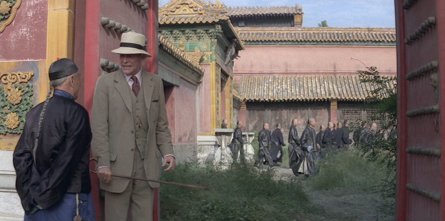
Till this moment the chromatic world of the film is quite poor: red, orange and yellow, alternated with the grey of the scenes of the prisons. Pu Yi has been living in the Forbidden City, ignoring the world outside it; when he starts to acknowledge the existence of that world,  the chromatic scale expands along with this knowledge. This change is represented by green, the colour of spring, of the nature that flourishes, of life that starts again. It represents the age around the 20 years, the study, the knowledge that takes us to freedom. It is brought with the introduction of the British tutor and the green bicycle he gave the emperor as a present.


The centre of our life is represented by blue. It is the colour of freedom,  perspicacity of thinking, the intellect; while red is the past and green the present, blue is the colour of the future. It is the complementary of yellow: while the latter represents the sun, blue is associated with the moon. The tone of the scenes changes into blue when the Emperor leaves the Forbidden City for the first time, exiled by communist: he always wanted to leave his "prison", his limited world but never could because they wouldn't let him. The exile is his freedom.


When Pu Yi realizes he want to be again the Emperor of China, the tone of the images becomes indigo. It is the colour associated to the age around 50. Indigo represents full maturity, material power, the achievement of a level of life, a new balance between reason and passion.


During the years Pu Yi is held in prison, the Chinese Government tries to re-educate him to communism. The tone of the scene shot in the prison is always been grey but, as soon has Pu Yi starts to accept his responsibility a violet tone appears. Violet is the full balance between passion and reason, is the diffusion of knowledge, it represents the cyclic nature of life and the age between 70 and 80.


White is the sum of all the colours, therefore it is the sum  of all the ages, of all the phases, feelings and passions. It is life as one, the union and the completeness of it and it is associated with the last years of life. The pure white appears for the first time with snow, when Pu Yi earns his freedom and gets out from jail as a free citizen of the People's Republic of China. He returns to the Forbidden City but this time the image is balanced, with no prevailing tone.


Throughout the film there's one more colour which is always present: black. It is the matrix, the matter, the birth of elements. It is the beginning and the end, the presence and the absence of something and, of course, the unconscious.


The Last Emperor is not only an example of great cinematography by Storaro, it is the demonstration that philosophy, psychology, history, painting and every kind of art go hand by hand with cinematography to achieve a creative and unique way to visually tell a story, it is a must-see film for every cinematographer, Dp or photographer who wants to improve his art.


October 03, 2013

Film review. An analysis of the cinematography of Kon-Tiki, by Joachim Ronning and Espen Sanberg

Kon-Tiki is a co-direction between Joachim Ronning and Espen Sandberg who already directed together theirs previous features (Max Manus, Bandidas). It is the Norwegian film with the highest budget ever produced and it is the official submission of Norway to the best Foreign language Film of the Oscar 2013.

The plot. It's a true story about explorer Thor Heyerdal who, in 1947, decided to cross the Pacific Ocean from Lima to Polynesia in a balsa wood raft to prove that Polynesia was first settled by south Americans and not from Asians.


Cinematography: Geir Hartly Andreassen
Camera:Arri Alexa Plus,Red One MX, Sony NEX-FS100
Lenses: Zeiss Master Prime, Fujinon Alura
Aspect ratio: 2.35:1
Format: ARRIRAW, Redcode RAW
Film Stock: -

As he already did for the previous two directors' features, Max Manus, Gair Hartly Andreassen is in charge for the cinematography of Kon-Tiki. I don't know his previous works so I am not able to say if the way he lit for Kon-Tiki is his own style or not. But, to be honest, I found that the cinematography did not have a structure throughout the film apart from few characteristics.

Since the beginning of the film, Andreassen makes use of wide angle lenses offering us some beautiful landscape shots, like the opening one, in the snowed Norwegian countryside, and, particularly, the shots of the raft while in the ocean. 

Light, at the beginning, has a natural feel: every light source is justified; day light, windows and artificial lights are used as sources, always softened by diffusers or, sometimes, smoke. Anyway, there are some shots where the light looses its naturalism and becomes a bit more theatrical, without really a reason. In the second half of the film, all the scenes are shot in the balsa-wood raft and light looses completely its natural feel. In the daytime scenes, contrast is never as high as it is under the sun in open ocean neither as harsh; in the cabin, I like the way Andreassen plays with the reflection of the sun passing trough the wooden roof, but I really miss some more contrast: light is very soft and the worry of filling up shadows caused problems of double shadow in some shots.  At night time, light imitates the moon light or lightning but not always with good results: there's always a Back Light cutting the characters out from the background that sometimes is too strong and sometimes unnatural, like in the storm scene, where moon light and lightnings coexist.

The strong Back Light is not a negative point though. This is another characteristic we find throughout the film and I quite like it actually, especially  I find very interesting the use of on set lights as light sources placed as Back Lights: lampposts, shop signs and neon lamps are used for this purpose, creating some very pleasant images. Even on the raft, characters are placed between the camera and the sun, producing beautiful flared or washed images. But it's true that sometimes the Back Light is far too strong, which can be disturbing and the problem is that we don't know if it is for a chosen aesthetic inspired by the original documentary Thor shot or the necessity of getting chroma right.

As it has become usual shooting with digital cameras, a soft filter has been used, probably a Pro Mist, to soften the image. Also we can notice some grain which add an organic look, though there are some shots, particularly the ones in low light conditions, where the presence of grain is too strong and not really pleasant: working at high ISO or shots taken with the NEX?

Kon-Tiki is a film with a lot of CGI which offers us some really spectacular images. It is entertaining even without the tension and the twists you normally expect from a film of this kind. Its cinematography, though, is quite fair to be honest, with very good approaches but with unhappy solutions too.


October 01, 2013

Light tips. How to light a subject with deep-set eyes.

Every subject is different and has different characteristics, that's why we have to light every subject with different light: lighting is a powerful tool to hide or enhance features in a portrait. Here are some tips about how to light a subject with deep-set eyes.

Do not use a harsh Key Light:  a harsh light will produce heavy deep shadows that will intensify the deepness.

Do not use a wide angle lens close to the subject: it increases distance between objects changing the apparent relationship between them, so the deep-set eyes would appear more sunken then they are.

Do use a low soft Fill Light: placing a Fill Light lower than the eyes will brightening them up eliminating the shadows. You could also use a reflector to bounce light up, as well as lowering the Key Light; and remember, softer the light, softer the shadows.

Do place the camera at lower angles: this will change the perspective, making the back-set eyes less perceptible.

Hope you find it useful! Stay tuned for more lighting tips!