October 14, 2013

Film review. An analysis of the cinematography of Gravity, by Alfonso Cuarón.

Gravity is the latest feature by Alfonso Cuarón (Children of Men, Harry Potter and the Prisoner of Azkaban, Y tu Mamá También), a sci-fi film that takes us into the space with Sandra bullock and George Clooney.

The plot. While outside the shuttle, on a spacewalk repairing a satellite, disaster hits the medical engineer Sandra Bullock and the veteran astronaut George Clooney; the shuttle is destroyed and they have to find a way to get back to earth.


Cinematography: Emmanuel Lubezki
Camera: Arri Alexa
Lenses: Zeiss Master Prime
Aspect ratio: 2.35:1
Format: ARRIRAW
Film Stock: -

Emmanuel Lubezki (Children of Men, The Tree of Life, To the Wonder, Ali) proves himself, once again,  to be one of the finest working cinematographer, and this time choosing digital (instead of the usual film stock) and showing us that he can master digital light too. Even if there's lots of CGI (almost everything you see on screen is fake), the cinematography of Gravity is absolutely stunning.

The approach to lighting Lubezki makes is, as he always uses to do, very natural: being in space, he uses the sun as main light source and very often as Key Light, both for the spacewalks scenes and the scenes shot inside the shuttle; but he also uses stars and the earth as light sources, the latter one as a big bouncer of the sunlight. Lubezki is not afraid of showing the sun light as it is, very harsh, so there are deep shadows, contrast is quite high and, sometimes, the image has blown highlight: that results not only in some visually beautiful images but also in a very natural feel which is one of the elements that make us be there in the space with Bullock and Clooney.

The difficulty Lubezki found was that he had to match all the CGI work: the only things "real" on screen are faces, everything else (including hands and legs) is computer generated; characters don't stand still, they float gently or move and change direction in space so the light had to match perfectly with the background: different speeds in movement, different contrast or wrong density would have broken the natural feel and the film would have not worked as it does. To make things easier, Lubezki created a box with LED screen and they shoot the actors inside of it: the LEDS were projecting the backgrounds of the scenes, lighting the actors and offering them visual references for acting (which a green screen would not offer).

The other element in Gravity's cinematography that helps to bring us into space is camera movement. Camara doesn't stop moving and it actually floats gently around characters  up and down and sideways giving us the impression of the lack of gravity. That was achieved thanks to Bot&Dolly, a robotic camera rig with 10 axis of freedom, which moved, along with the background on the LED panels, to trick the eye and make us think the actors are moving (while they are actually standing still).

The exclusive use of wide angle lenses also helps to this purpose: we are into the action close to the actors and sometimes we take their place like in some subjective shots as we see the action trough the visor of the helmet. Remarkable is the second sequence of the film where the camera approaches slowly to Sandra Bullock and ends up entering her helmet as the shot turns into a subjective one.
The shots are, as Cuarón got us used to, very long ones. The first sequence, for example, lasts almost 20 minutes and introduces the audience into the emptiness of the space and its absence of gravity, and this feeling will be kept throughout the film: it is very interesting how the tension and the anguish is maintained trough these long shots (when normally the same effect is achieved by fragmenting the action in several shots).

Even if with plenty of CGI (I'm not really fond of it at all), Gravity is a film with an excellent aesthetic, its cinematography is a feast for the eye and, given last years trend, I'm pretty sure it will win this year Oscar. It's a pity that the film is just pure entertainment and offers little room to think; also I think it would have worked much more better if the audience could connect and emphasize with characters, thing which doesn't happen.


October 13, 2013

Stills from Films. A possible light diagram of a scene from Snow White and The Huntsman


Cinematography: Greig Fraser
Camera: Arriflex 235, Arriflex 435 Advanced and ES, Panavision 65 HR and Milennium XL2, Red Epic
Lens: Panavision Primo, E and G Series, ATZ, System 65
Aspect ratio: 2.35:1
Format: 35mm, 65mm, Redcode RAW
Film Stock: Kodak Vision 5201 50D, 5207 250D, 5230 500T

Greig Fraser did a great job with the cinematography of Snow White and the Huntsman, a film that neither critics nor audience liked very much, combining 35mm and 65mm, along with some shots with the Epic. This is one of the very few scenes exclusively lit by natural light and it is a beautiful example of back lighting. This shot would not have been the same if Panavision E Series anamorphic lenses hadn't been used with the lovely and gorgeous typical flares they produce.


October 11, 2013

Light tips. How to light a subject with a wrinkled face.

Every subject is different and has different characteristics, that's why we have to light every subject with different light: lighting is a powerful tool to hide or enhance features in a portrait. Here are some tips about how to light a subject with a wrinkled face.

Do not use a harsh Key Light: it will produce deep strong shadows and intensify wrinkles.

Do not use Back Light on one side: a side light enhances textures: placing a back light on one side of the subject will emphasize wrinkles.

Do use a frontal Key Light: a light placed in front of the subject will reduce textures. Avoid placing it too high or you will have the same negative effect of a side light. Place it low instead.

Do use soft low Fill Light: it will fill up the shadows of the wrinkles created by the Key Light. Lowering the contrast will also help to mask wrinkles.

Hope you find it useful! Stay tuned for more lighting tips!

October 10, 2013

The colors of Autumn in Montreal


I was walking around Montreal the other day, a rainy one. All of the sudden the sun managed to come out for a brief moment lighting the trees across the street. I didn't hesitate and took a pic with my iPhone. Sometimes the camera isn't really important: it's all about light.

October 09, 2013

Film review. An analysis of the cinematography of Barry Lyndon, by Stanley Kubrick

Barry Lyndon didn't receive a big commercial success when it was released back in 1975. But now it is considered one of Kubrick's finest film. It is a film on a grand scale which abounds in meticulous technical  craftsmanship and it owes its success to Kubrick, of course, but also to cinematographer John Alcott and electronic engineer Ed DiGiulio.

The Plot. Barry Lyndon is a slightly thick, hungrily ambitious young Irishman who longs tu pull himself up by his low-born origin into the superficial and illusory world of the nobility, and he almost succeeds in doing it.


Cinematography: John Alcott
Camera: Arriflex 35BL, Mitchell BNC
Lenses: Canon K35, Zeiss  ƒ 0.7, Angenieux 25-250
Aspect ratio: 1.66:1
Format: 35mm
Film Stock: Kodak Eastman 5254 100T

John Alcott already worked with Kubrick as cinematographer in his previous works (2001: A Space Odyssey and A Clockwork Orange), he was actually promoted by Kubrick during the shooting of 2001; but saying that Barry Lyndon's cinematography is Alcott's job would not be right. It is instead a close collaboration between Alcott and Kubrick, who was a fine photographer himself. The result is a delicious feast for the eye, where each composition is like a painting by one of the old Master.

They actually studied and searched for lots of references in the paintings of the Dutch Masters but they seemed to them to be a bit flat so they decided to light the scenes a bit more from the side. Anyway, they went after a pictorial style with a soft and subtle rendition of light and shadows.

John Alcott used to define himself as a natural light cameraman: he managed to master light to naturally light the scene in all of the features he DP'd and, of course, Barry Lyndon is no exception; in fact it was the first historical film to be lit in a natural way: lighting in a more theatrical way was the trend at that time for that kind of features. Throughout Barry Lyndon, there's a constant feeling of natural light coming through the windows of the locations simulated by Mini-Bruts always placed outside the houses where they shot. Anyway, there are some scenes, like the one with Barry and Captain Potzodof, lit with light placed on top of their head which is no really justified nor natural.

They had to gel windows and use different ND to stop down the light and, despite the "rules", they never used a 85 filter to colour correct the light to give an overall consistent balance throughout the film and because of the low light conditions of exterior light they had to deal with sometimes: in this way they managed to keep the extra 2/3 of a stop the filter would have taken down.

Shooting exteriors was a problem because the brightness of the day changed a lot so they had to change the aperture constantly to match the brilliance (not always achieving it thou), finding themselves to shoot with full aperture: the Canon K35 T1.2 come quite helpful in several shots.

Instead of using diffusion filters, quite trendy at that time, Alcott and Kubrick decided to use Low Contrast Filter which is not really consistent throughout the entire picture but doesn't affect the overall cinematography. In the wedding sequence we notice the use of the filter combined with a brown net which gave Alcott a more control over the highlights. Another filter Alcott used unconventionally is the Graduated Neutral Density filters, making use of them for interior shots (Was he probably the first one to do so?).

Another interesting technique used by Alcott is the use of mixed coloured light during the film. In the scene of Barry's room after he has had his leg amputated, for example, a warm effect is achieved by placing 1/2 sepia gel over the light coming through the window. While, when Barry's boy is dying, the natural blue day-light comes trough the window without colour correction.

Camera movements are used in certain sequences but without making an excessive use of them, like travellings and handheld camera for the scenes of the battle. But the use of the Angenieux zoom is always preferred, zooming in to close ups from very wide shots in a voyeuristic manner, and the other way round, opening from a close up to reveal the whole scene. The zoom was used along with travelling too, like the scene of the battle, where a very long travelling is used and the zoom starts at 250mm with a close up.

But, the most interesting and probably most technically difficult scenes to shoot were definitely the candle lights scenes. The naturalism in the way of lighting reaches its extreme because no natural light was used whatsoever: the scenes are lit exclusively by candles, which was something technically impossible given the available means  of those years. But Kubrick's stubbornness and Ed DiGiulio's expertise made history. Kubrick discovered some Zeiss lenses which were designed for the Hasselblad NASA took to the expedition to the Moon and which had a maximum aperture of ƒ 0.7. DiGiulio made the necessary adjustments to fit the Mitchell camera. 
They placed candles all around the scene and used a 70 candles chandelier  with metal reflectors attached to the ceiling bouncing light down. The had lots of trouble with focus because of the very shallow depth of field and the impossibility of checking on a viewfinder due to loss of luminance, but the result is superb.

Barry Lyndon is a marvellous film, the composition of every scene is perfect and precise, one of the great and emblematic Kubrick's characteristic, and its cinematography is beautiful and innovative, and, even if more than 35 years have passed, today it keeps on being a reference for every photographer or cinematographer.


October 07, 2013

The kiss. A tribute to Love on black and white film


Definitely my favourite pic of this shooting because of the contrast, the pose, what the models express and, of course, the theme...

October 04, 2013

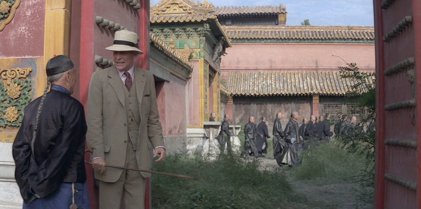
The psychology of colour in cinematography. A study of The Last Emperor

Vittorio Storaro is one of the best cinematographers of all time. We can admire his magnificent use of light in film that will remain in our memories, like Apocalypse Now, Last tango in Paris, 900, Dick Tracy and, The Last Emperor. In the latter, his studies and experiments with colours as a mean to communicate emotions reach a high grade of expressive maturity that powerfully enhances the already magnificent cinematography of the film. As you all know, the film deals with the last emperor of China, from his birth till he becomes just another worker of the People's Republic of China, it is an introspective story of the Emperor. According to Storaro, every particular colour is not only a bridge with a particular emotion but light and colour make react body and mind in different ways (daylight is associated with activity, for example, while night is with reflection); colours can also be associated with a particular age of our life,  so he decided to separate the different ages of the Emperor chromatically, lighting with different tone of lights accordingly to the age and mood. But he didn't limit himself to just play with hues, he also created contrast with colours (as he already did in Apocalypse now) and played with the colour of objects in scenes using what in literature is called anaphora, a repetition of the same colour, in our case, to emphasize a concept.


In The Last Emperor's first scene we see a group of prisoners arriving to a station and waiting for being transferred to a prison. The Emperor is among them. The scene is quite dark, in a grey tone, with practically no colour. Grey is an undefined colour; it represents the waiting, the reflection, the preparation for a new journey, for the start of a new life. All the scenes in which the Emperor is in jail are in grey

 
While at the station, the Emperor try to commit suicide, which is itself a symbol of death and rebirth, and we see the first colour: the red of the blood. The following scene opens with big red doors opening; the baby emperor is taken away from her mother; all this scenes have red tones. Red is the first colour of the chromatic scale. It symbolizes the birth, the vital impulse, the start of every thing (later, when the emperor gets married, red will be the predominant colour in objects in the scene). In the first scene it also symbolizes, of course, Communism and its effects on the Emperor


The second colour is orange. It is associated with the range of age between 5 and 8 years; it leads us into the life, it is the warmth of the family, the domestic colour. In the scenes with orange tone, Pu Yi arrives to the Forbidden City, to his new family.


Pu Yi is still a child when he becomes emperor: the tone of the scene becomes yellow. Yellow can be associated to 10 to 15 years of age; it is the colour of puberty, it's intuition and awareness. It is the colour of light, it symbolizes the sun, the divine and its presence, it's the colour of the empire. Storaro uses it throughout the film not only as a tone but even placing in the scene objects of this colour, like the scene of the little emperor playing with the yellow banner which lifts up revealing the courtyard of the Forbidden City full of eunuchs: the rise of the emperor above his subjects.


Till this moment the chromatic world of the film is quite poor: red, orange and yellow, alternated with the grey of the scenes of the prisons. Pu Yi has been living in the Forbidden City, ignoring the world outside it; when he starts to acknowledge the existence of that world,  the chromatic scale expands along with this knowledge. This change is represented by green, the colour of spring, of the nature that flourishes, of life that starts again. It represents the age around the 20 years, the study, the knowledge that takes us to freedom. It is brought with the introduction of the British tutor and the green bicycle he gave the emperor as a present.


The centre of our life is represented by blue. It is the colour of freedom,  perspicacity of thinking, the intellect; while red is the past and green the present, blue is the colour of the future. It is the complementary of yellow: while the latter represents the sun, blue is associated with the moon. The tone of the scenes changes into blue when the Emperor leaves the Forbidden City for the first time, exiled by communist: he always wanted to leave his "prison", his limited world but never could because they wouldn't let him. The exile is his freedom.


When Pu Yi realizes he want to be again the Emperor of China, the tone of the images becomes indigo. It is the colour associated to the age around 50. Indigo represents full maturity, material power, the achievement of a level of life, a new balance between reason and passion.


During the years Pu Yi is held in prison, the Chinese Government tries to re-educate him to communism. The tone of the scene shot in the prison is always been grey but, as soon has Pu Yi starts to accept his responsibility a violet tone appears. Violet is the full balance between passion and reason, is the diffusion of knowledge, it represents the cyclic nature of life and the age between 70 and 80.


White is the sum of all the colours, therefore it is the sum  of all the ages, of all the phases, feelings and passions. It is life as one, the union and the completeness of it and it is associated with the last years of life. The pure white appears for the first time with snow, when Pu Yi earns his freedom and gets out from jail as a free citizen of the People's Republic of China. He returns to the Forbidden City but this time the image is balanced, with no prevailing tone.


Throughout the film there's one more colour which is always present: black. It is the matrix, the matter, the birth of elements. It is the beginning and the end, the presence and the absence of something and, of course, the unconscious.


The Last Emperor is not only an example of great cinematography by Storaro, it is the demonstration that philosophy, psychology, history, painting and every kind of art go hand by hand with cinematography to achieve a creative and unique way to visually tell a story, it is a must-see film for every cinematographer, Dp or photographer who wants to improve his art.