Showing posts with label film review. Show all posts

November 06, 2013

Film review. An analysis of the cinematography of Only God Forgives, by Nicolas Winding Refn

Only God Forgives is the last film by the Danish director Nicolas Winding Refn (Drive, Bronson, Valahalla Rising) which was selected in last year Cannes Film Festival official Competition.

The plot. A drug smuggler owns a Thai box gym in Bangkok as a front for his drug operations. When his brother is killed, his mother, and chief of the organization, arrives urging him to find his brother's killer and revenge him.


Cinematography: Larry Smith
Camera: Arri Alexa Plus, Red Epic
Lenses:  Cooke S4
Aspect ratio: 1.85:1
Format: ARRIRAW, Redcode RAW
Film Stock: -

Only God Forgives is the second collaboration between director  Nicolas Winding Refn and cinematographer Larry Smith (The Guard, Bronson) who worked as gaffer and lighting cameraman in Kubrick's Eyes Wide Shut, Barry Lyndon and The Shining. His election for digital and cameras such as the Arri Alexa and the Red Epic is justified not only for budget reasons but also because they were working with a 7 weeks schedule with numerous locations, so they had to be quick and fast at shooting.

The image is softened with  the lenses used, the Cooke S4, as we can notice by its signature: the octagonal iris. Borders are soft, contrast isn't high and the transition to out-of-focus areas is soft too, while skin tones are slightly warmer. Definitely one of the best solutions to give the digital format a cine-like look.

Most of the times Smith chooses a one-light-set-up to light the scene. It is often a strong light which falls onto the characters after passing trough some kind of grid, painting patterns of strong shadows on character's face and body, which is visually interesting. This kind of lighting is obviously theatrical and it is reinforced with the beautiful use of on set lights, like Chinese lanterns in the karaoke club  or the lights on the wall at the restaurant, creating a more natural and diffused light.
But the characteristic of Smith's cinematography which is predominant throughout the film is the use of colored filters on light. In order to recreate the ambient of Bangkok and of the places where most of the scenes where shots, lights are filtered with red gels. Sometimes different colours filters, mainly blue, are used so colour contrast is strongly increased. There are scenes, like the fight one,  lit with a red tone ambient light  while the key light lighting the characters is white: bright neons and strong reds coexist to transmit the feeling of a city and a story filled up with blood, eroticism, violence and darkness.

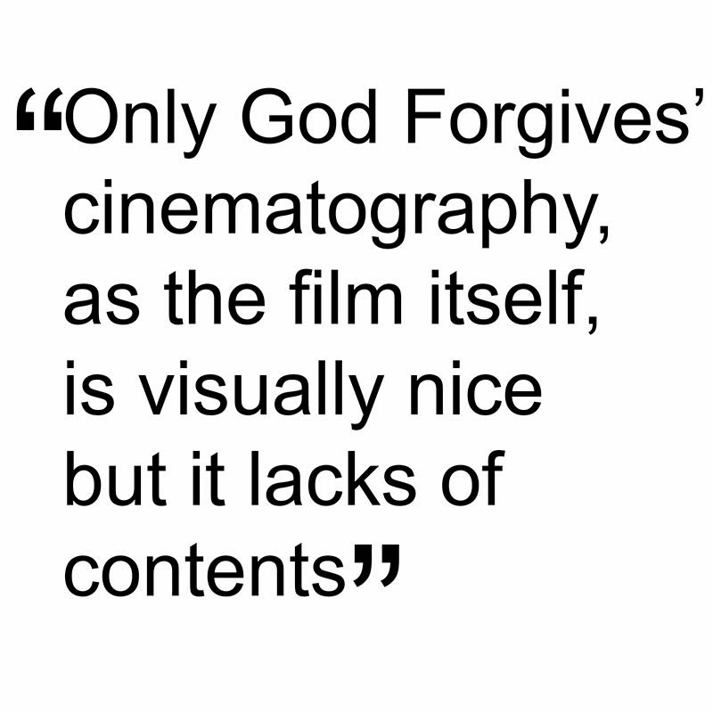
Anyway, Only God Forgives' cinematography is meant to visually impress only. There are some beautiful images in the film but they are just that: they don't enhance character's feelings or the story which itself is also meant to impress and is missing something that has to be basic for a film: content.

October 30, 2013

Film review. An analysis of the cinematography of Prisoners, by Denis Villeneuve

Prisoners is the last work by Quebecois director Denis Villeneuve (Incendies, Polytechinque, Maelström), a suspenseful as well as disturbing thriller with a great script.

The Plot. On thanksgiving day, two six year old girls disappear. Despite the police investigation, which seems to lead nowhere, the father of one of the girls decides to take matters into his own hands, using desperate and unorthodox methods.


Cinematography: Roger Deakins
Camera: Arri Alexa Plus and Studio
Lenses:  Zeiss Master Prime
Aspect ratio: 1.85:1
Format: ARRIRAW
Film Stock: -

Prisoners is the first collaboration between director D. Villeneuve and one of the finest living cinematographers, Roger Deakins (Skyfall, No Country for Old Men, A Beautiful Mind, The Hurricane...) and the result is outstanding.

Once again, the British cinematographer chooses the Arri Alexa and Master Prime Zeiss lenses to shoot Prisoners: this choice is not only dictated by Deakin's preferences and own style, but also for the way of shooting the film and the results he was expecting. The resolution, the latitude and the details offered by camera and lenses were necessary to shoot often in very low light conditions without jeopardizing the image quality and neatness.

Light has a natural feel throughout the film. Most of the time characters are lit with a single light placed outside windows when it imitates the daylight or on one side in the indoor shots imitating on set lights. Sometimes the only lights used on scene are headlamps, flash-lights, neons or candles, and it's in these scenes where we can see Deakins' great work: contrast is high, light is low and shadows are really deep and yet the image is clean and beautiful.

Prisoners is a dark film and Deakins shows it by the way of lighting. There's no sign of the sun throughout the film: all the exteriors are shot on dull days, sometimes in rainy or even snowy ones. That results in an overall grey tone with desaturated colours, an aesthetic that goes very well with the story. In the indoor shots, characters are almost always backlit or side lit, creating silhouettes and  a strong contrast. By this way of lighting, characters are often shadows that move in the scene: this suits perfectly the characters who have somehow something to hide.

As a good thriller as it is, Prisoners releases pieces to complete the puzzle one by one; to enhance this concept Deakins offers us some of the most artistic images of the film. The frame is like a black canvas where the British master draws few brush-stroke of light, lighting half a face of a character or some details of the scene. The shadows gain great importance for the story: they are what is not seen or known, the secrets and the unconscious, they are where the truth lays.

Camera movements are dosed and imperceptible helping the audience to stay in the story, a purpose also achieved by the focal lengths used, never too wide  nor too telephoto, always staying within the normal range of the 50mm, avoiding perspective distortions and offering a more natural look.

Prisoners is a very well made film brilliantly directed by D. Villeneuve who managed to build tension since the first frame. With his stunning work R. Deakins teaches us that cinematography isn't necessarily about where placing the camera to get the best possible angle, but it's about enhancing the story and finding the way to make a moment or an emotion more beautiful, more intense, more powerful. 

October 03, 2013

Film review. An analysis of the cinematography of Kon-Tiki, by Joachim Ronning and Espen Sanberg

Kon-Tiki is a co-direction between Joachim Ronning and Espen Sandberg who already directed together theirs previous features (Max Manus, Bandidas). It is the Norwegian film with the highest budget ever produced and it is the official submission of Norway to the best Foreign language Film of the Oscar 2013.

The plot. It's a true story about explorer Thor Heyerdal who, in 1947, decided to cross the Pacific Ocean from Lima to Polynesia in a balsa wood raft to prove that Polynesia was first settled by south Americans and not from Asians.


Cinematography: Geir Hartly Andreassen
Camera:Arri Alexa Plus,Red One MX, Sony NEX-FS100
Lenses: Zeiss Master Prime, Fujinon Alura
Aspect ratio: 2.35:1
Format: ARRIRAW, Redcode RAW
Film Stock: -

As he already did for the previous two directors' features, Max Manus, Gair Hartly Andreassen is in charge for the cinematography of Kon-Tiki. I don't know his previous works so I am not able to say if the way he lit for Kon-Tiki is his own style or not. But, to be honest, I found that the cinematography did not have a structure throughout the film apart from few characteristics.

Since the beginning of the film, Andreassen makes use of wide angle lenses offering us some beautiful landscape shots, like the opening one, in the snowed Norwegian countryside, and, particularly, the shots of the raft while in the ocean. 

Light, at the beginning, has a natural feel: every light source is justified; day light, windows and artificial lights are used as sources, always softened by diffusers or, sometimes, smoke. Anyway, there are some shots where the light looses its naturalism and becomes a bit more theatrical, without really a reason. In the second half of the film, all the scenes are shot in the balsa-wood raft and light looses completely its natural feel. In the daytime scenes, contrast is never as high as it is under the sun in open ocean neither as harsh; in the cabin, I like the way Andreassen plays with the reflection of the sun passing trough the wooden roof, but I really miss some more contrast: light is very soft and the worry of filling up shadows caused problems of double shadow in some shots.  At night time, light imitates the moon light or lightning but not always with good results: there's always a Back Light cutting the characters out from the background that sometimes is too strong and sometimes unnatural, like in the storm scene, where moon light and lightnings coexist.

The strong Back Light is not a negative point though. This is another characteristic we find throughout the film and I quite like it actually, especially  I find very interesting the use of on set lights as light sources placed as Back Lights: lampposts, shop signs and neon lamps are used for this purpose, creating some very pleasant images. Even on the raft, characters are placed between the camera and the sun, producing beautiful flared or washed images. But it's true that sometimes the Back Light is far too strong, which can be disturbing and the problem is that we don't know if it is for a chosen aesthetic inspired by the original documentary Thor shot or the necessity of getting chroma right.

As it has become usual shooting with digital cameras, a soft filter has been used, probably a Pro Mist, to soften the image. Also we can notice some grain which add an organic look, though there are some shots, particularly the ones in low light conditions, where the presence of grain is too strong and not really pleasant: working at high ISO or shots taken with the NEX?

Kon-Tiki is a film with a lot of CGI which offers us some really spectacular images. It is entertaining even without the tension and the twists you normally expect from a film of this kind. Its cinematography, though, is quite fair to be honest, with very good approaches but with unhappy solutions too.


July 10, 2013

Film Review. An analysis of the cinematography of La Migliore Offerta by Giuseppe Tornatore

La Migliore Offerta (The best Offer) by acclaimed Italian director Giuseppe Tornatore (Baaria, Malena, Cinema Paradiso) was one of the three Italian movies whose screening I was waiting for since they have been released in Italy earlier this year.

The plot. Geoffrey Rush is an eccentric art auctioneer who rejects every kind of relationship with people, especially with women. But he starts to be obsessed with an heiress who wants to sell her family's works of art and whose agoraphobia makes her even more eccentric than he is. 


Cinematography: Fabio Zamarion
Camera: Arri Alexa Studio
Lenses: Zeiss Master Prime
Aspect ratio: 2.35:1
Format: Arriraw
Film Stock: -

G. Tornatore doesn't have a trusted cinematographer he usually works with; he changes quite a lot. He already worked with Fabio Zamarion in The Unknown woman and the documentary L'ultimo Gattopardo but he didn't call him for the magnificent Baaria, his last movie before La Migliore Offerta. Zamarion is known for Respiro by E. Crialese and Evilenko but his filmography is best known for his work as a camera: Goya en Burdeos and Tango by Saura, Little Buddha and The Last Emperor by Bertolucci among others. So he had one of the best teacher possible: Vittorio Storaro. Unfortunately, in La Migliore Offerta, very little of the master's legacy can be seen

I don`t mean at all that Zamarion badly lit the film, but its cinematography is impersonal and undefined. This way of lighting was probably chosen to make the audience pay attention to the plot but a cinematographer's job is not only to illuminate a scene with sufficient light to record it on a sensor or a film. Placing a light on the right has a meaning, placing it on the left or above has another one: that is what I missed in Zamarion's cinematography. 

Light is always soft and diffused, even outdoor, as well as natural, so, when windows are not used as light sources (very balanced contrast, by the way, when they are in shot, with details both in highlights and shadows) light comes from above.  Side lighting set-up is preferred thou, which is a very good election for the story: throughout the film the audience doubt about the real intentions of the characters who have a lot to hide so, leaving them half in shadow and half in light enhances this concept (the same Storaro taught that light is the conscious and shadow the unconscious). But contrast is never strong and shadows are soft as there were an intention of showing everything in the scene; to remain with Storaro's teching, by this way only the conscious is visually represented, not the unconscious.

However, Zamarion's choice of lighting works well in the scenes held in Oldman`s house: it emphasizes the eccentric art auctioneer's pulchritude and clinical order (even his wardrobe and collections of gloves and ties are held and placed as they were pieces of art in a museum); moreover the camera follows him in a slight low angle giving the character  the importance and the authority he really possesses in his life, but, the camera maintains the low angle even at the end, where the character is lost and defeated, which is contradictory.

The Zeiss Master Prime lenses' hardness is softened with a diffusion filter, probably a Pro-Mist, and the camera is sometimes placed in interesting angles; but when we see Claire's house for the first time, in a wide shot, the barrel distortion is not corrected, resulting in converging lines that make the image not quite pleasant.

Zamarion's cinematography of La Migliore Offerta is quite fair then, even though we can enjoy some beautifully composed and lit images that are spread all over a film that, in my opinion, deserved more from a visually point of view. La Migliore Offerta, anyway, is well directed but its script is predictable and sometimes improbable; I understand Tornatore's need and desire to film stories different and far from the ones told in his Sicily but, being such a great director as he is, I expect him to deliver us a work whose quality is at the same level his previous works are: La Migliore offerta failed to satisfy this expectation of mine.

June 12, 2013

Film review. An analysis of the cinematography of Sightseers by Ben Wheatley

Sightseers is a British black comedy by Brighton based director Ben Wheatley (Kill List, Down Terrace); it was screened in the Director's Fortnight section of Cannes Film Festival last year.

The plot. Chris takes her girlfriend Tina, who never left her house and her mother, to a trip around Yorkshire with a caravan. But soon unfortunate events make them become condescending psycho killers.


Cinematography: Laurie Rose
Camera: Red MX
Aspect ratio: 2.35:1
Format: RedCode RAW
Film Stock: -


Ben Wheatly knew Laurie Rose when shooting Down Terrace, which was the first film both of them ever shot; since then Rose has DP'd all Wheatley`s work, including Sightseers. In an interview after the film première, Rose insisted that he was not comfortable with being called cinematographer or DP: he was just a simple cameraman. After watching Sightseers I realized that he was not trying to be just modest:  Sightseers lacks in cinematography

Light crew was reduced to a minimum and so were lights used and that can be noticed since the very first scenes, where the image is quite flat and the contrast poor. Light is natural and quite soft, almost shadows free, even in the exteriors, where the typical British overcast days helped to diffuse light. When the sun came out though, we can appreciate some harsh light and strong shadows creating an atmosphere that doesn't really serve the story. 

The camera Rose chose was a Red One with MX sensor, a great camera, but he didn't manage to get the best of it. Throughout the film there are scenes (indoor or outdoor shots) with very bright spots with blown out highlights, which is quite unusual for a camera with 13 stops of dynamic range. Also Roses didn't used many lenses, sticking basically to the 50mm Arri Zeiss and switching to wide angle lenses for landscapes, to keep the natural look of the film, almost shot as it were a documentary. Camera movements are very little used; often camera is hand-held and sometimes placed in very low angles (and perhaps missing a wider angle lens), different and unexpected decisions that never contribute visually to the story. 

It looks like Rose limited himself to expose correctly the scenes, but, as we have seen in past posts, cinematography is much more than this and a correct exposure is not always the right one. Some scenes of Sightseers though are beautifully shot: some foggy landscapes and scenes filmed outdoor at sunrise or sunset, some back-lit, others with wanted gorgeous flares, but all of them with nice contrast and tones and shot with wide angle lenses.

Sightseers is a (literally) bloody good fun but also a bit obvious and predictable, and probably less mysterious and interesting than Wheatley's last work, Kill List.
Cinematography: Emmanuel Lubezki
Camera: Arricam LT, Arriflex 235, Panavision, Red MX,
Lenses: Arri Zeiss Master Prime
Aspect ratio: 2.35:1
Format: 35mm, 65mm, Redcode RAW
Film Stock: Kodak 5218
- See more at: http://donatelloromanazzi.blogspot.com.es/2013/06/film-review-analysis-of-cinematography.html#sthash.1odzoTYW.dpuf

Cinematography: Emmanuel Lubezki
Camera: Arricam LT, Arriflex 235, Panavision, Red MX,
Lenses: Arri Zeiss Master Prime
Aspect ratio: 2.35:1
Format: 35mm, 65mm, Redcode RAW
Film Stock: K
- See more at: http://donatelloromanazzi.blogspot.com.es/#sthash.KI6SyFZy.dpuf

Cinematography: Emmanuel Lubezki
Camera: Arricam LT, Arriflex 235, Panavision, Red MX,
Lenses: Arri Zeiss Master Prime
Aspect ratio: 2.35:1
Format: 35mm, 65mm, Redcode RAW
Film Stock: K
- See more at: http://donatelloromanazzi.blogspot.com.es/#sthash.KI6SyFZy.dpuf

Cinematography: Emmanuel Lubezki
Camera: Arricam LT, Arriflex 235, Panavision, Red MX,
Lenses: Arri Zeiss Master Prime
Aspect ratio: 2.35:1
Format: 35mm, 65mm, Redcode RAW
Film Stock: K
- See more at: http://donatelloromanazzi.blogspot.com.es/#sthash.KI6SyFZy.dpuf

Cinematography: Emmanuel Lubezki
Camera: Arricam LT, Arriflex 235, Panavision, Red MX,
Lenses: Arri Zeiss Master Prime
Aspect ratio: 2.35:1
Format: 35mm, 65mm, Redcode RAW
Film Stock: K
- See more at: http://donatelloromanazzi.blogspot.com.es/#sthash.KI6SyFZy.dpuf
Cinematography: Emmanuel Lubezki
Camera: Arricam LT, Arriflex 235, Panavision, Red MX,
Lenses: Arri Zeiss Master Prime
Aspect ratio: 2.35:1
Format: 35mm, 65mm, Redcode RAW
Film Stock: Kod
- See more at: http://donatelloromanazzi.blogspot.com.es/p/film-review.html#sthash.tIPS4wjN.dpuf
Cinematography: Emmanuel Lubezki
Camera: Arricam LT, Arriflex 235, Panavision, Red MX,
Lenses: Arri Zeiss Master Prime
Aspect ratio: 2.35:1
Format: 35mm, 65mm, Redcode RAW
Film Stock: Kodak 5218 500T, Kodak 5217 200T, Kodak 5219 500T
- See more at: http://donatelloromanazzi.blogspot.com.es/p/film-review.html#sthash.tIPS4wjN.dpuf
Cinematography: Emmanuel Lubezki
Camera: Arricam LT, Arriflex 235, Panavision, Red MX,
Lenses: Arri Zeiss Master Prime
Aspect ratio: 2.35:1
Format: 35mm, 65mm, Redcode RAW
Film Stock: Kodak 5218 500T, Kodak 5217 200T, Kodak 5219 500T
- See more at: http://donatelloromanazzi.blogspot.com.es/p/film-review.html#sthash.tIPS4wjN.dpuf

June 05, 2013

Film review. An analysis of the cinematography of To the Wonder by Terrence Malick

Few days ago I had the opportunity to watch again To the Wonder, a film by Terrence Malick who needs no presentations: The tree of Life, The thin red Line, The new World, Badlands are some titles of his filmography. It was a great delight to enjoy once again the work of one of the best cinematographer of the present time: Emmanuel Lubezki.

The plot. An American falls in love with a divorced girl living in Paris. She follows him and settles in Oklahoma but problems arise in their relationship. Meanwhile, a priest struggles against his faith.


Cinematography: Emmanuel Lubezki
Camera: Arricam LT, Arriflex 235, Panavision, Red MX,
Lenses: Arri Zeiss Master Prime
Aspect ratio: 2.35:1
Format: 35mm, 65mm, Redcode RAW
Film Stock: Kodak 5218 500T, Kodak 5217 200T, Kodak 5219 500T

Terrence Malick relies once again on the cinematography of Emmanuel Lubezki whose filmography is quite extensive ( Ali, The New World, Sleepy Hollow, Meet Joe Black, Y tu mamá también...). As he already did it in The Tree of Life, the mexican cinematographer only makes use of natural light for filming To the Wonder, using just bouncers and blockers. According to him, "natural light is more complex than artificial light and once you master it, it is hard to go back and illuminate a scene artificially". He not only did an excellent job with that but also taught (or reminded) everyone that everything has to serve cinematography to visually tell a story in the best way possible: not only trough light, costumes design and colours, lenses and camera movements, but even trough the film stock, the camera itself and the format used.

Throughout the film, Lubezky always seeks back-light; in the exterior shots the sun is always low in the horizon and quite often in frame, he plays with it, positioning the actors between it and the camera, avoiding the silhouette and shooting them shadow free, and looking for light spills and flares every time they move, overexposing some areas of the frame. In the shots taken indoors the back light is more extreme: he uses doors and windows as light sources and the actors are dense black silhouettes. Shooting indoor must have been complicated: with light changing constantly Lubezki only had few useful hours in every location. They shot fast and they shot a lot, because they didn't have to "waste" time moving lights, and probably shot some hours in a house and some hours in an identical one but architecturally different to take advantage of the entire shooting day.
In the few night time shots, available light of lamps is used: they are always in frame and overexposed, creating great contrast in the scene.

Five different cameras were used to shoot To the Wonder. The film starts with some images of the couple in a train taken with a digital camera full of digital artifacts but it does remind a super-8 camera and the feeling of holiday and happy memories, like the beginning of a relationship. When Marina (Olga Kurylenko) goes back to Paris, Lubezki follows her alone in the street at night using a Red MX, giving a sense of modern and urban life (in contrast with the Oklahoma surroundings) as well as a sense of cold solitude. All the rest of the film is shot in 35mm apart from the scenes where Ben Affleck starts a relationship with an old friend, Rachel McAdams: here the 65mm negative is used. This relationship is less romantic but more stable than the one with Marina: for Lubezki the 65mm reflects this more realistic stability.
Camera is rarely static: always flowing with the characters, mostly following them, on a steady-cam or hand-held, and always going forth, suggesting the idea that life always goes on. Lubezki chose, as in The Tree of Life, Master prime lenses which offer a very clean and sharp image, mostly using wide angle lenses, achieving a very great depth of field which suits perfectly Malick's way of directing especially because the director rarely leads the eye of the spectators toward the actor, and offers them the whole frame instead.
Terrence Malick is a peculiar director with a peculiar style pretending to make poetry with images. You can like his style or hate it. And To the Wonder is no exception. The movie was shot without a script, almost has no dialogue and no plot nor action: it is absolutely visual, showing moments of the life of a couple and it's up to the spectator to shape a story. Whatever you like his style or not, To the Wonder is a cinematographic piece of art which confirms Lubezki as one of the best living cinematographer capable of creating stunning beautiful images and a visual storytelling second to none. To the Wonder is an exquisite visual experience, completed with great music and editing,  that will undoubtedly be in this year top five best cinematographies.